
My Role
Logo Design
Environmental Design
Print collateral
Identity collateral
Pattern Design
Packaging
Overview
Based on the “kaiten sushi” invention of the revolving sushi conveyor belt Genki Sushi combines traditional sushi with modern technology. Some stores feature double rail express systems with touch-screen ordering capabilities.
Genki has a “sister store” called “Sen-Ryo” which is geared towards higher end audience, while Genki is geared towards a broader audience. Genki sushi started in 1990 but has now expanded to 4 different countries outside Japan – Kuwait, Hong Kong, Singapore and United States.
Genki Sushi Brand
I conducted extensive research on Genki Sushi Restaurant as well as the their competitors, following an in-depth process to define the brand and create visual assets that are representative of the brand essence and help the client to stay relevant in the competitive restaurant industry.
Brand Promise
We are adaptable to changing trends in the market place, while creating an upbeat atmosphere and providing timely exceptional service.
Brand Attributes
We enable people to get introduced to Japanese dining experience through providing a great value sushi and a quality, timely customer service.
Brand Positioning
Genki Sushi provides an accessible Kaiten Sushi experience at an affordable price.
Brand Character
Timely, Adaptable, Friendly.
Target Audience
Primary target audience are students of the Seattle Central College as well as families with children.
Secondary target audience are people who never tried sushi, who would enjoy the americanized offerings.
New Brand Identity
Once the brand has been defined, I started exploring the way to express the brand. I did a lot of sketches and ended up with a logo that I feel represents them best.
Logo
I kept their target audience in mind – this restaurant as the place where you would go with your friends to or where you can bring your family and kids to. I chose the fish as a mark as it is a sushi restaurant. I sketched a lot and arrived at current mark. The concept of the gathering place is expressed in grouped organically shaped pieces of fish. That is echoed in the typeface selection for the name. It has a Japanese feel and is also reminiscent of pieces of sushi. The fun and young feel is expressed through the use of different colors.
Clear Space
Clear space with the logo should be used in this manner. I used the fish to show how much clear space is needed around the logo.
Branding Colors
Patterns
I have designed a library of patterns to be used keeping the target audience in mind.
Business Cards
I have designed business cards for the restaurant as well as for corporate employee use.
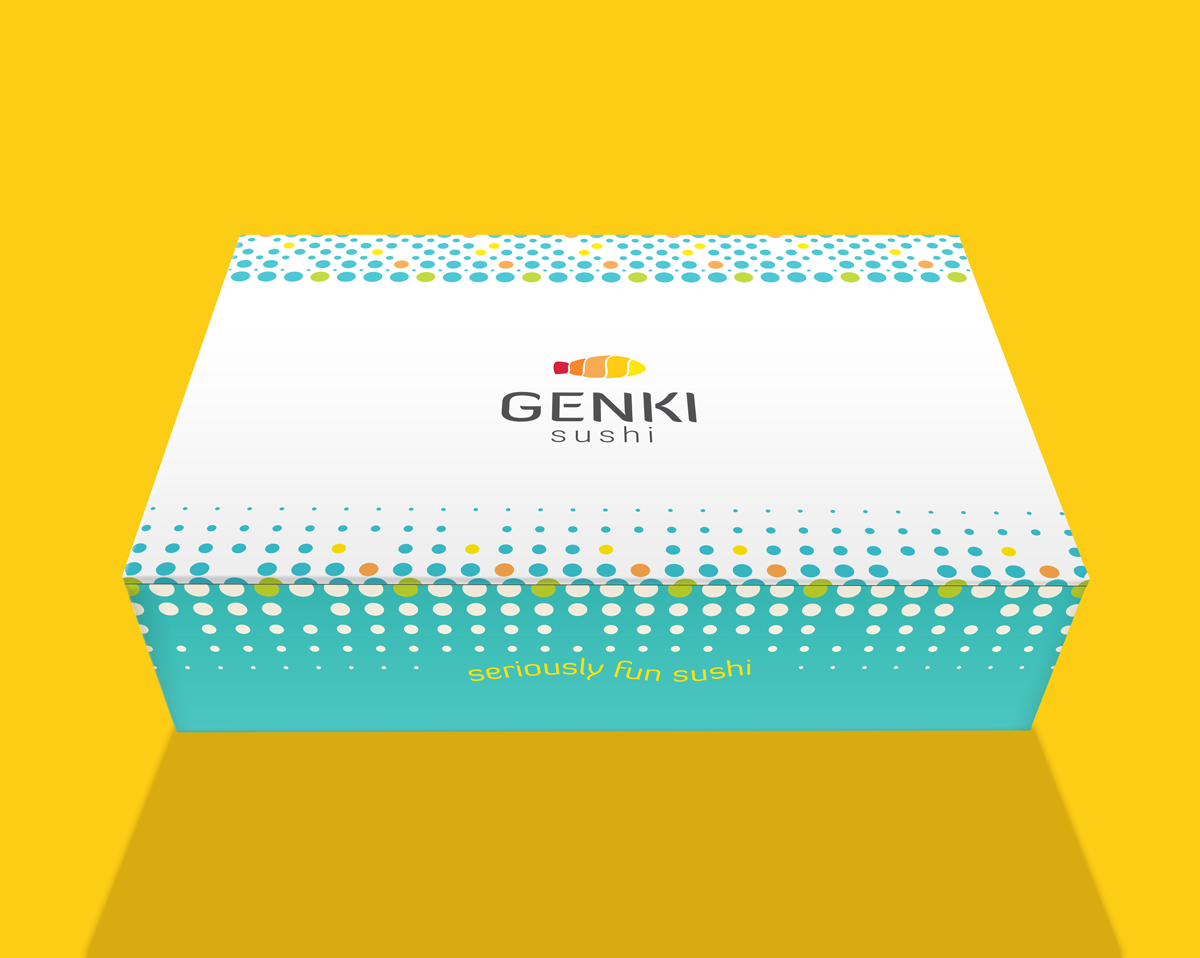
Takeout Box
There is always a need for a takeout box in the restaurant business. I went with simple and approachable design as it felt on brand for the target audience.
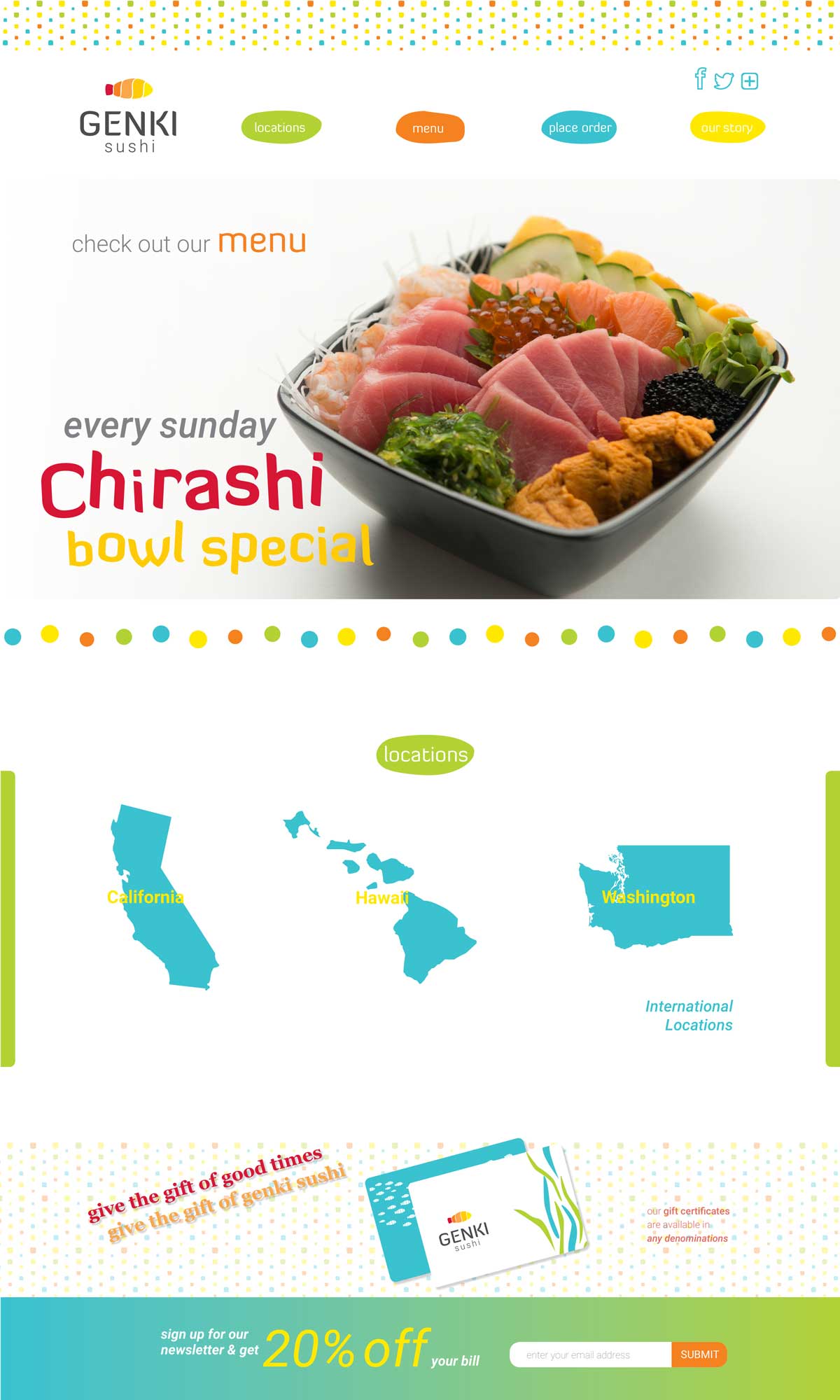
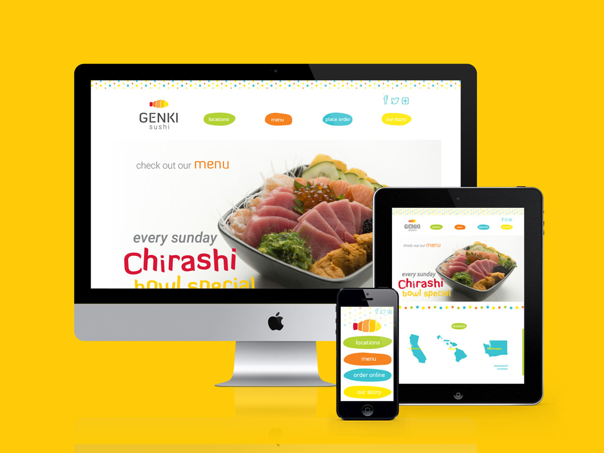
Web Presence
I have also developed web presence. I thought about the nature of the brand and brand character and developed a homepage that is easy to use, that is fun and approachable. I used the hero image to inform the user of the special that is being ran as well as an easy way to access the menu.
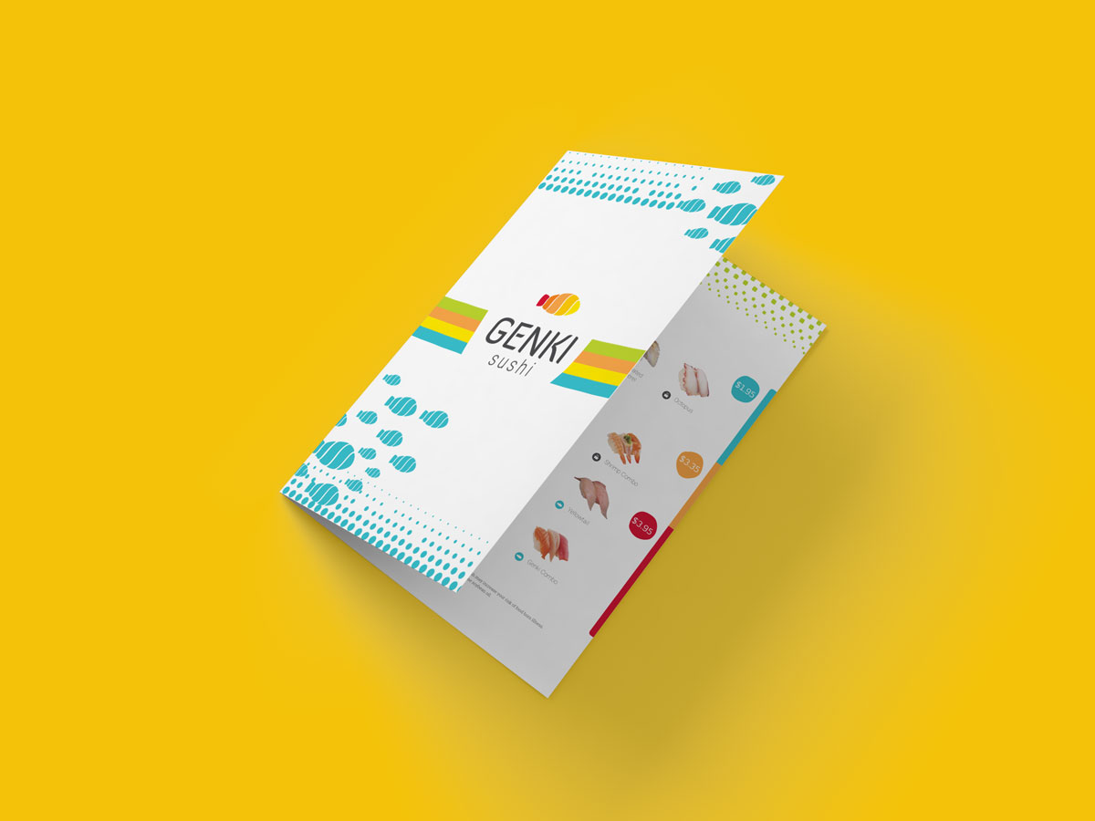
Menu
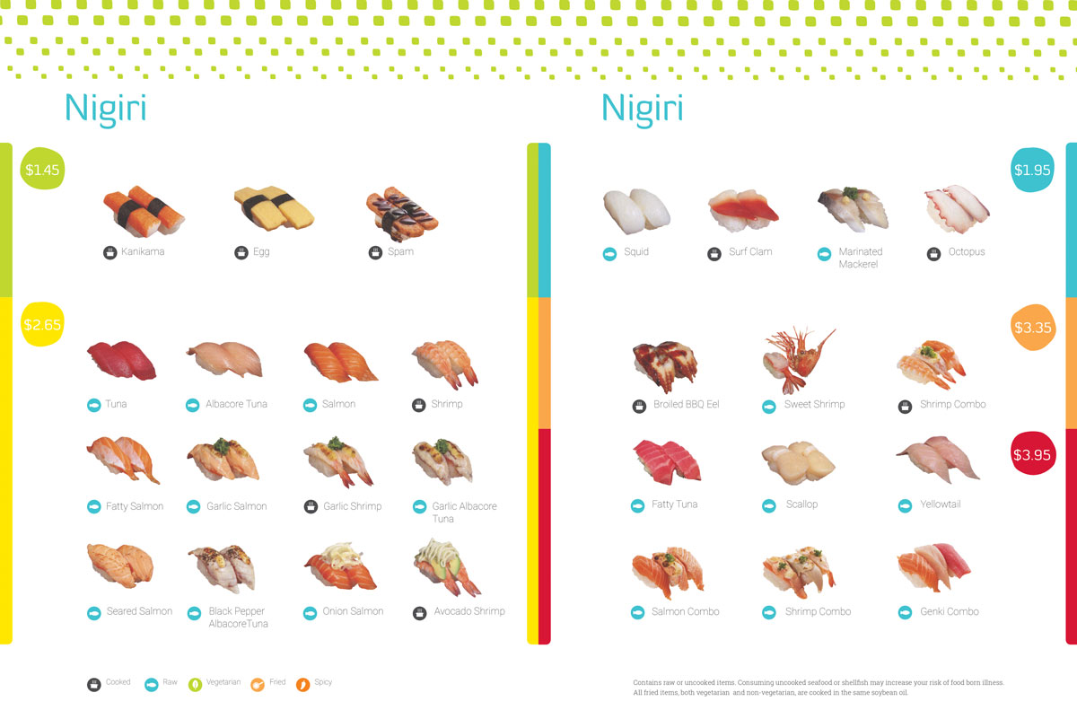
I have designed the menu.
Menu Detail
Environmental Graphics
I also designed a a window decal for the Capitol Hill restaurant location. This location lacks visibility, so I felt that a window decal would be a great solution for the visibility problem, which would increase the much needed foot traffic.


