Overview

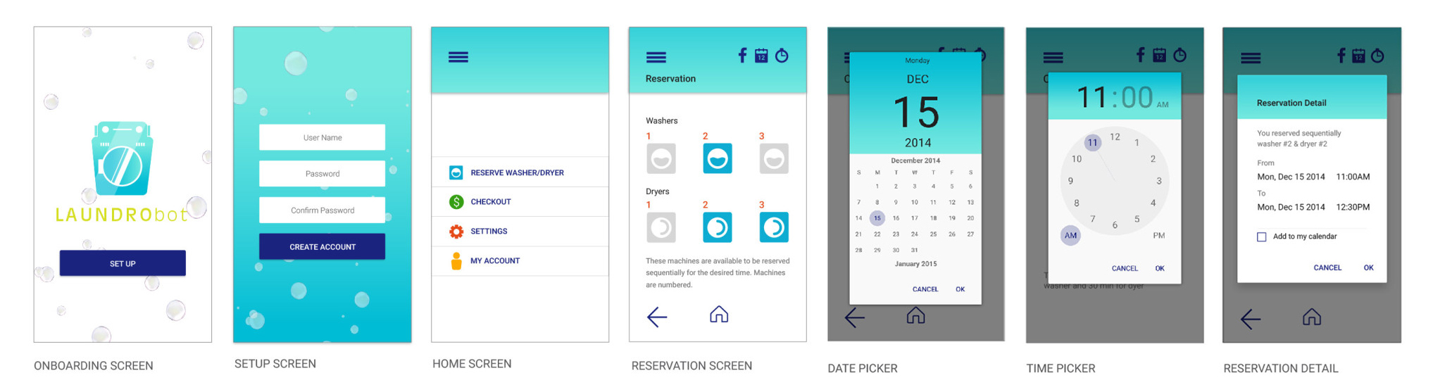
Doing laundry at the apartment complex laundry room is a hassle. In many instances users have to get quarters, potentially make multiple trips in hope of finding an available washer/dryer, run the risk of their laundry being handled by someone else if the user is late or forgets to take it out.

Laundrobot app allows user to reserve washer/dryer in advance or on the spot, to get notified when the laundry load is done, and to pay for doing laundry with their phone.

My role
  • User Interviews
  • User Personas
  • Wireframes
  • User Journey
  • UI Design
  • Prototyping
  • Research
  • Web Design
Length of project

1 Month

Tools
  • Photoshop
  • Illustrator
  • Flinto
  • WordPress
Team

2 designers

Project Requirements

The trend of apps that assist with the laundry is relatively new but is continuing to grow, as people are trying to solve the problem of bad user experience when doing laundry at a public laundry room.

Once the problem has been identified, we have identified the following tasks that required our attention

  • Create user survey
  • Build user personas based on our research findings
  • Create user journey
  • Define task flows and app features
  • Build wireframes
  • Conduct user testing to assess usability
  • Create a small design system
  • Skin the wireframes
  • Produce a prototype
  • Design and build a landing page to promote the app online

Research

I conducted research on laundry apps to see which laundry apps existed at the time. I found that while there were few successful apps that allow user’s laundry to be picked up, cleaned and delivered back to them like Washio and FlyCleaners, there were no apps that would allow to reserve the washer/dryer and pay for the laundry using their phone on the market at the time.

I’ve created a simple Google Forms survey and have surveyed 26 users. All of the users reported not enjoying the experience of doing laundry at a public laundry room, viewed it as a necessary evil.

Users

Based on the feedback and the demographic information collected in our survey, I have developed the user personas to help us gain insights into who our users are.

1

Jane, 23 y.o. student

She is employed part time as a barista. Her income is <$24k a year. She is single and rents an apartment with a roommate in the city.
2

Mario, 24 y.o. self-employed

He is a single, self-employed plumber with an income of $50k a year. He rents an apartment with a roommate in the city.
3

Jenna, 28 y.o. student

She is a single female, full time student. She doesn't have an income, her parents help her with her expenses. She is renting an apartment in the suburbs.

User Journey

I thought about the user’s cycle from discovery to evangelism. I thought of places that they could have learnt about the app. I also thought about what could go wrong with the app and what could serve as a source of frustration for the user.
The most common frustrations reported by users in my survey were fruitless trips to the laundry room in hope to get unoccupied washer or dryer, needing to get quarters, as well as someone else handling user’s laundry. Based on that I’ve created the customer journey to what the user’s pain points are.
Based on my whiteboarding ideation session, I’ve created the customer journey to what the user’s pain points and delights are.

Task Flows

We have came up with the task flows. We kept the steps that are necessary to complete a given task to a minimum.

User Testing

To test our assumptions, I’ve created a simple prototype in Flinto and have distributed the link to download the prototypes onto a few users’ phones. The test was built around the tasks described above:

  1. Reserve washer/dryer
  2. Pay for the load of laundry

We’ve conducted user testing using a wireframe prototype. Luckily for us it was easy to find our target users to test the app. According to our user research the majority of people has had experience using a public laundry room.

Design System

We followed Google Material Design Guidelines in creation of our design system. We wanted it to be fun, simple and contemporary looking. We chose subtle gradients and bright colors, so the task of doing laundry would seem less of a chore.

App Screens

After a couple of rounds of user testing and working out a design system, we fleshed out the screens. Then we tested again for good measure. We created these using Google Material Design Guidelines.

Mobile App Prototype

I have created a prototype to illustrate the interaction as well as get the app tested by the users.

Landing Page

I designed and coded a landing page to help promote the app. Since the purpose of a landing page is to attract, inform  and convert potential users, I focused on making the design attractive and keeping the page informative but concise.

The idea for the design was to use bubbles as a backdrop. I used brand colors and the same typeface selection for visual consistency across all platforms.

VISIT

What I've learned

I’ve learnt that sometimes inspiration strikes during the process of design. It occurred to me that this app could potentially expand into the IoT app, as few users expressed interest in a feature that would tell whether the laundry is done drying or not. There could be a heat resistant sensor placed into the dryer that would transmit that information to the app. Though facing the time constraints, this idea needed to be set aside for another time.