Paying for gasoline is antiquated, awkward, and a bad user experience. In addition to having to wait in line, users have to get out of their vehicles to interact with poorly designed interfaces.
We set out to redesign Costco’s gas payment process.
Paying for gasoline is antiquated, awkward, and a bad user experience. In addition to having to wait in line, users have to get out of their vehicles to interact with poorly designed interfaces.
We set out to redesign Costco’s gas payment process.
2 Weeks
The RFID tag on the windshield of the car stores membership information and gets scanned as the vehicle approaches the pump.
The credit card info and preferences get stored in Costco’s database.
The new touch screen gas pump interface speeds up the process of the checkout. For those users that prefer not to use their phone for payments, the membership card scanning process is still in place.
The customer gets greeted with a personalized greeting based on their membership info scanned.
This improves the customer experience by reducing time spent in line and allows them to spend more time doing the things they enjoy.
To do so successfully, the following things were required of our team:
I have researched Costco as a company, their philosophy, and who Costco members typically are. In addition, I’ve created a survey in an effort to not to miss something, as well as conducted user interviews.
Through the survey and the interviews I’ve learnt that the most favorite thing for Costco Gas customers was the great value and the least favorite thing was the long lines at the gas pump. Which seemed to be dependent on each other, since good value fuels the demand.
The users reported the need to scan two cards – the membership card and the credit card as annoying. We took that into consideration when we were designing the features for the app.
Based on survey results, it became evident that we wouldn’t able to solve the waiting in line problem, however, if we could shorten the wait — that would improve experience greatly for Costco members.
Based on the results of the research and the survey, I have created user personas. The majority of consumer Costco customers are middle to upper middle class females that are 35 y.o. and older.

We thought about what would the payment process work and what it would look like? We came up with the following process: costco member could get an RFID for their car. It would only store their membership number. As the car would pull up to the pump, the membership info would get read by the scanner. The payment information would get accessed by the built-in computer within the pump itself. All of the technologies currently exist.
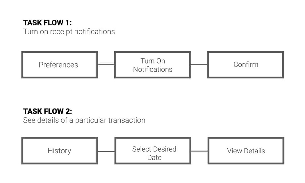
We’ve analyzed the information in the survey and defined the features of the app, and built task flows based on the user feedback.

I’ve built wireframes based on survey feedback and the paper prototyping. Then I went through the round of user testing, recorded feedback and adjusted the designs based on that.

After the second round of user testing we created the screen designs. The user interface was influenced by the Material Design Guidelines. I kept the screen design simple and easy to understand, so the even not very tech savvy person could carry out tasks with ease. As part of this project, we decided to do a small rebrand/ We wanted to update the logo slightly to emphasize the expediency. However, we wanted to avoid too drastic of an update, not to turn off the existing customers. Our team created an updated look for the logo and a chevron banner.

We came up with a new gas pump UI design as part of payment process redesign. Our users indicated that they perceive gas pump interface and the whole pumping process as unclean, and much preferred a touch screen display.
I created this video to explain the interaction at the touch screen gas pump interface.
I have created a prototype to illustrate interaction with the phone app.
During this project I’ve learnt that when working on a process redesign, it is important to actually go and assess the existing process on location. It helps in understanding user’s perspective.