Overview

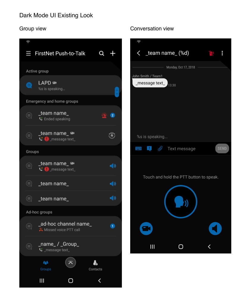
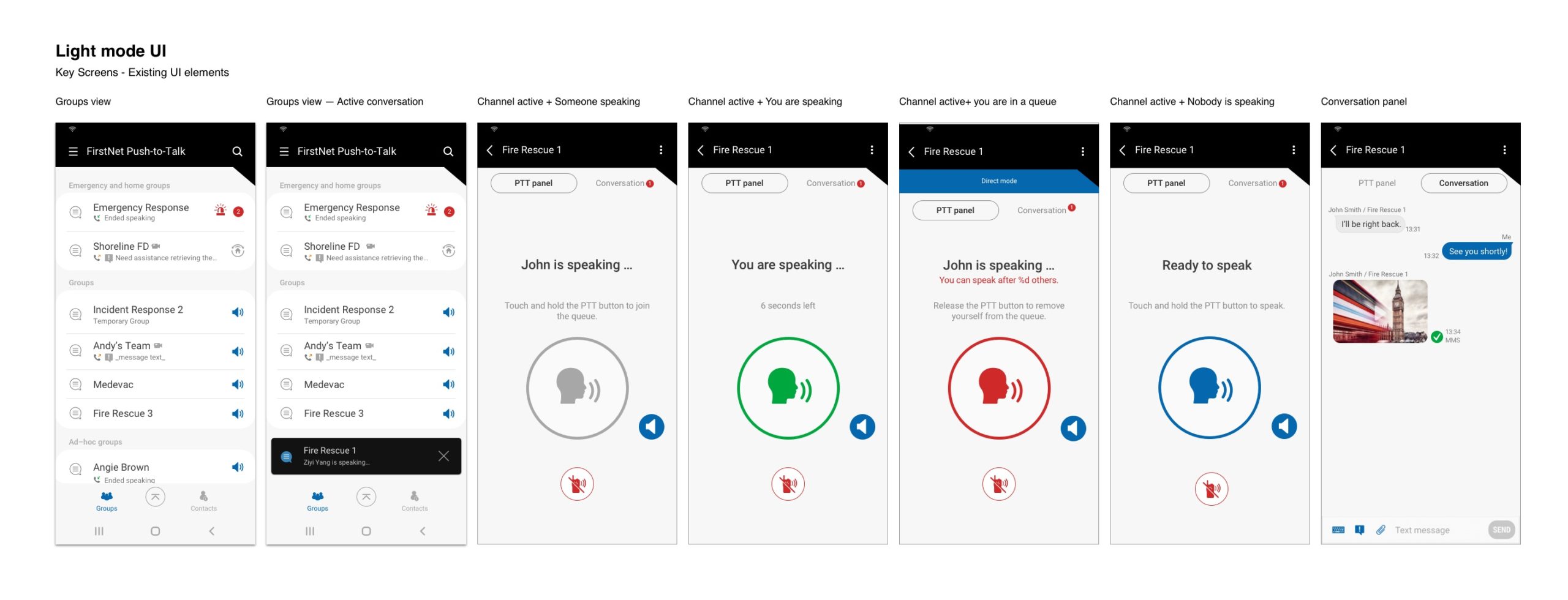
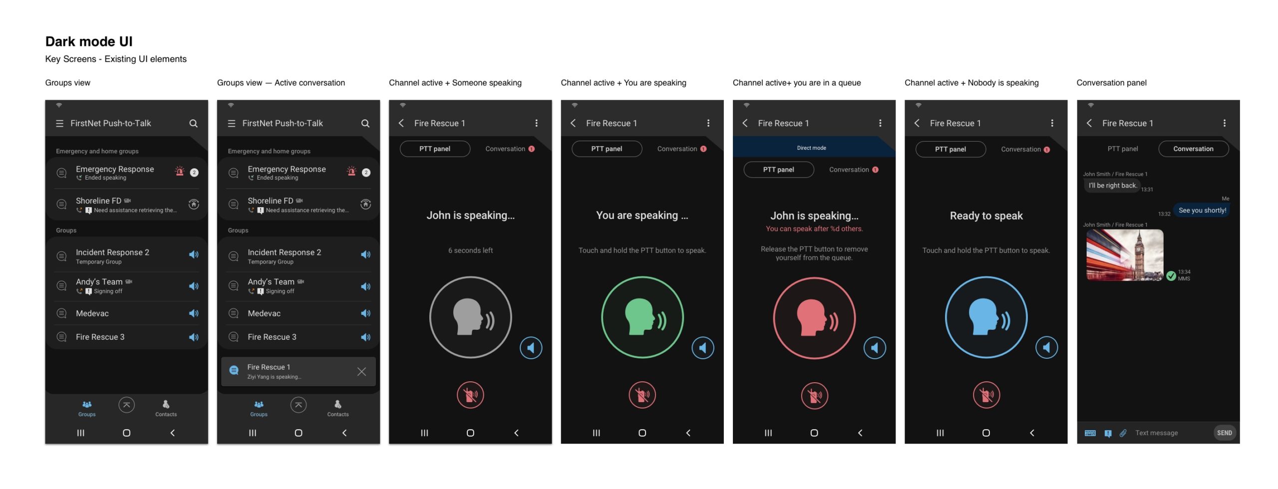
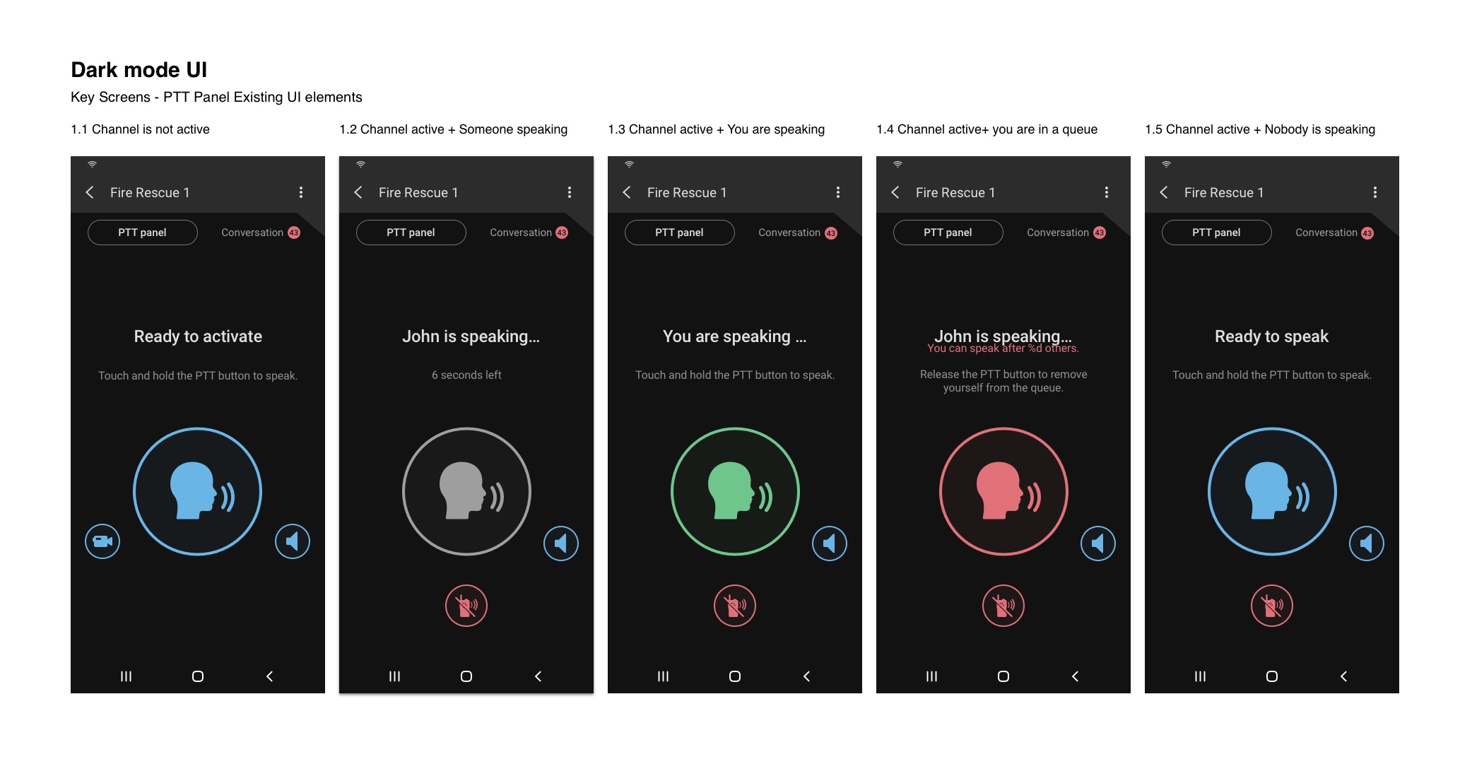
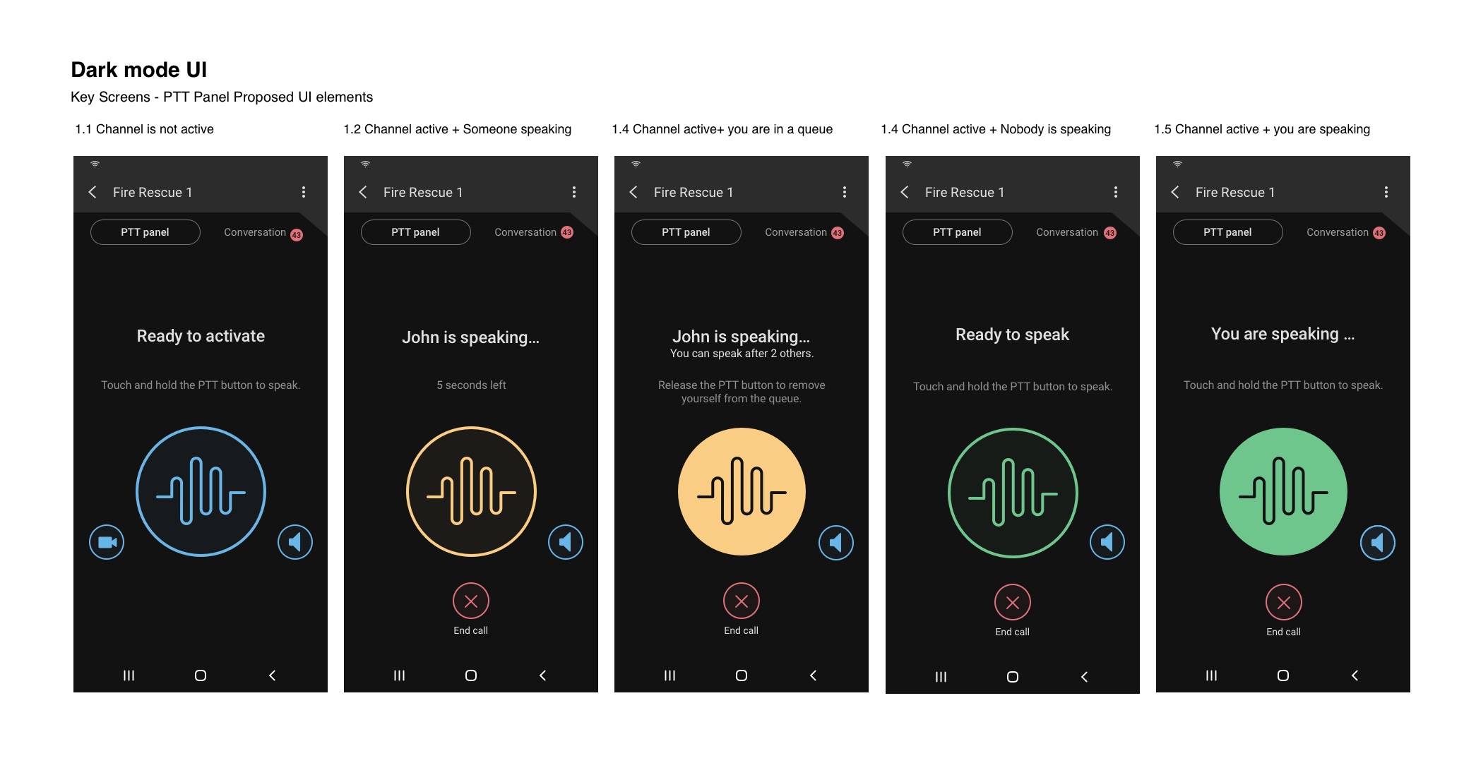
Samsung is working with a US-based carrier on a Mission Critical Push-to-Talk (MCPTT) App to be used by first responders. The app was created for the 4 types of mobile devices, including Android and IOS based. A need for a Dark Mode UI has been identified during the current design and development cycle.

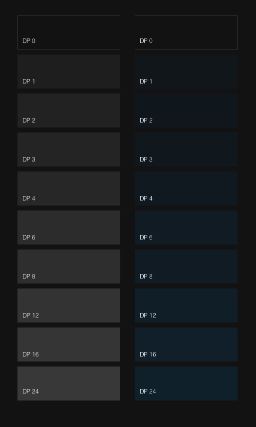
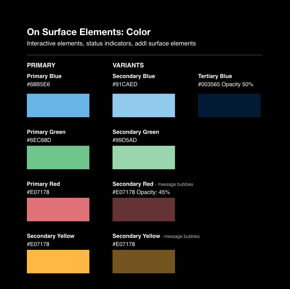
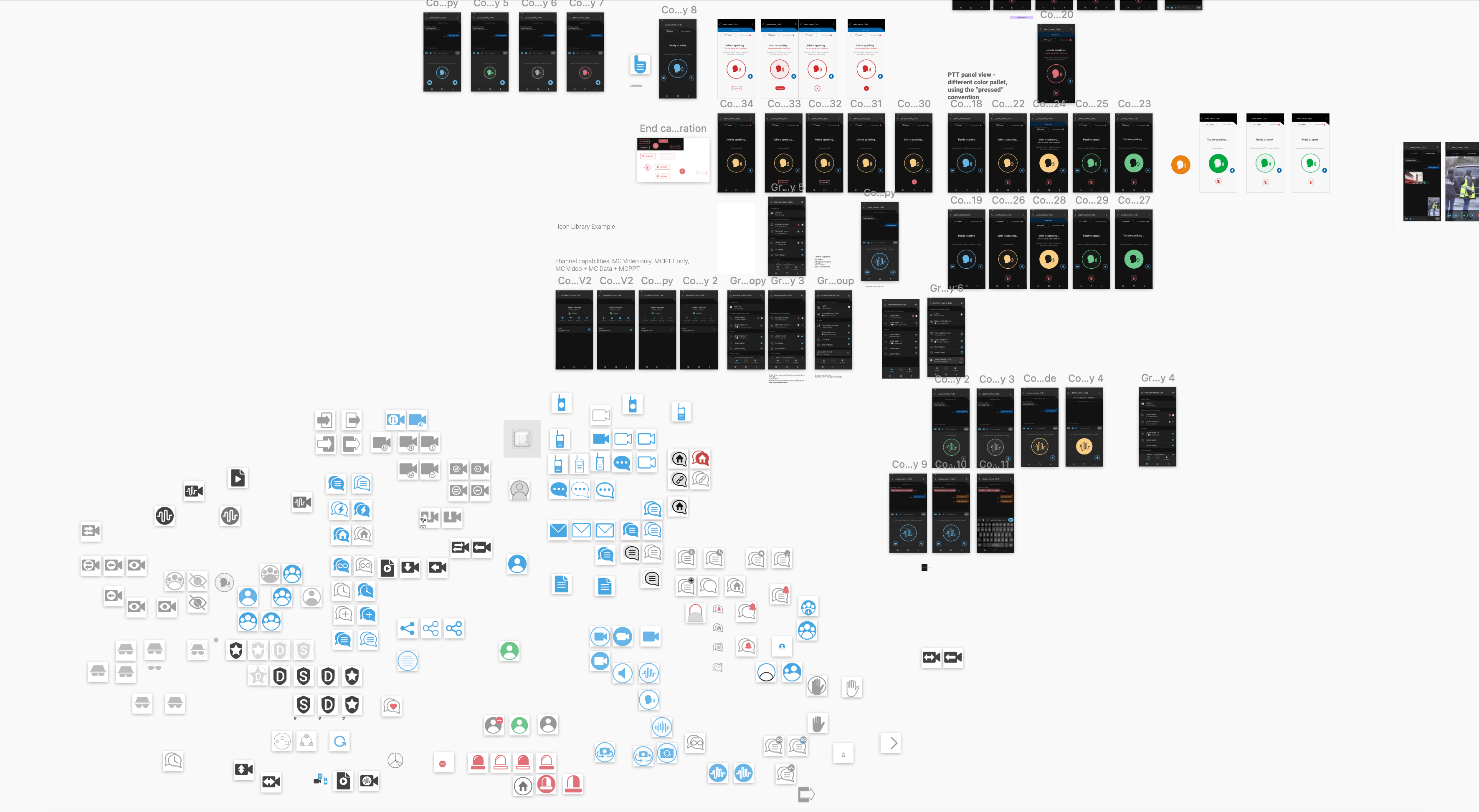
Later in the cycle, a need for a Design System has been identified as well.

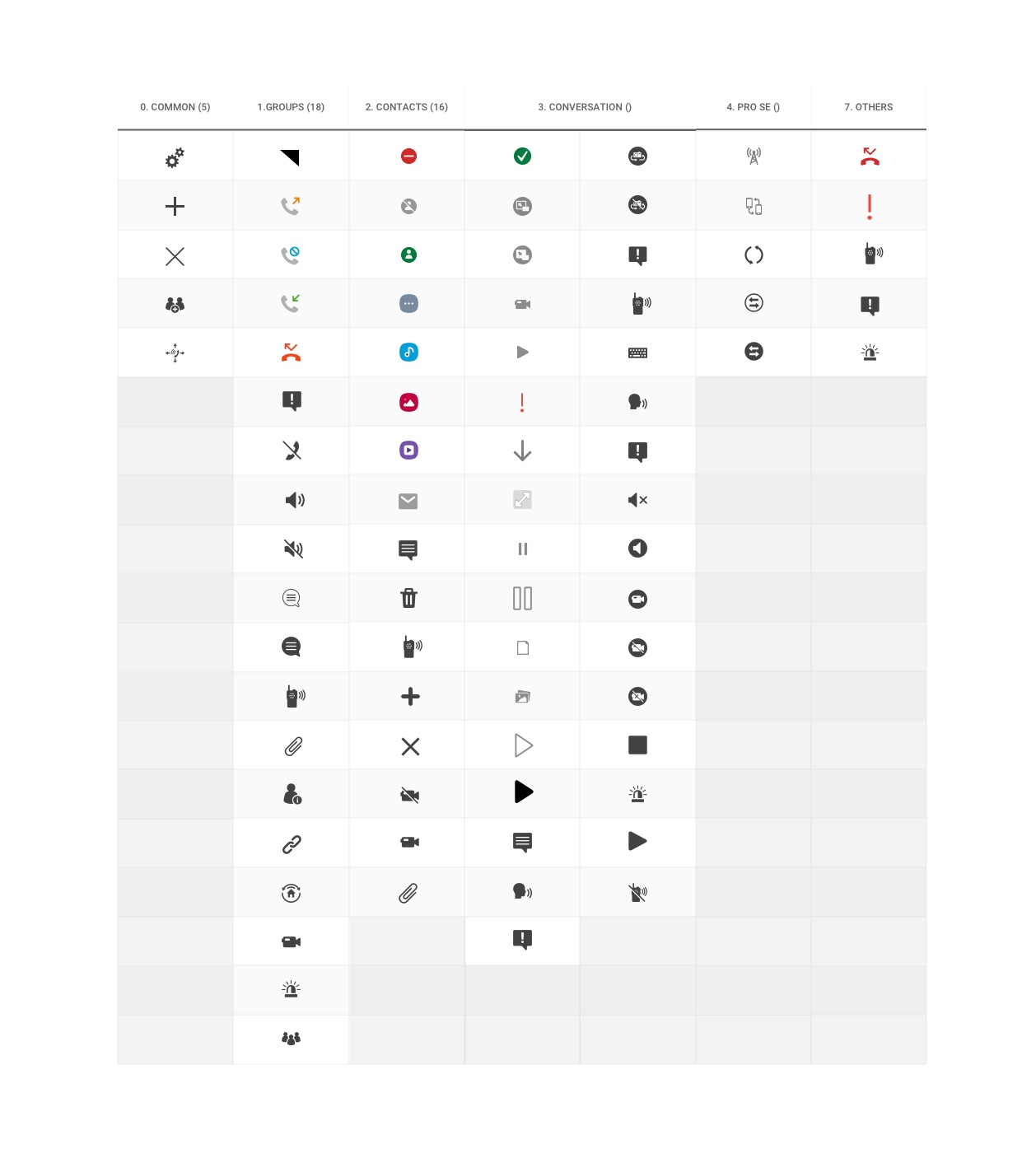
I led the design efforts in the creation of the V2.5 and V3.0 for the Dark Mode, created visual updates for the iconography, and laid the groundwork for MCPTT Design System.

My role
  • UI design
Length of project

4 months

Tools used
  • Sketch
Team
  • 1 UX / UI Designer

Phase 1 Dark Mode

Requirements

  • Create Dark Mode Screens for the app versions 2.5 and 3.0
  • Type contrast ratio should be at a level of 4.5:1
  • Graphic elements contrast ratio should be at a 3:1 level
  • Overall branding should be adhered to
  • The interaction and elements should follow Android and IOS design patterns

Visual Heuristics

I started my process by assessing the existing technical implementation guidelines. It became apparent quickly that the current default Dark Mode based on Samsung’s proprietary OneUI design system does not work well with the branding, nor does it comply with the accessibility requirements.

Research and Studies

I have researched how to build a Dark Mode for an interface. Based on that I used Google Material Design Dark Theme method, which is based on elevation of the surface for creating a depth perception.

I have proposed 2 visual treatments:

  1. Neutral Surface Color
  2. Branded Surface Color

For color, it was necessary to desaturate the primary colors for them to work well in a low light emitting colors of the surface elements.

At the end, the Neutral Surface Color option was selected.

End Result

Phase 2: Further improvements

Requirements

Based on the limited feedback from the end users, and as an overall visual enhancement to the app, I proposed changes to the iconography.

The challenge lies in this project being B2B and having a limited user feedback.

  • Create compelling iconography to elevate the look of the app
  • The iconography has to be visually related to the existing set of icons

Visual Heuristics

I inventoried the icons used on each screen of the app to see where can the visual improvement can be made.

The current icon library used within the app was a mix of carrier’s icon library and Samsung’s OneUI icons.

Based on my findings, I suggested some improvements. A few icons got dropped because they were not relevant and added visual clutter to the interface.

Iconography Exploration

Based on my exploration, I have identified and designed the text labels treatments and badges to distinguish certain team members, like Dispatchers, Supervisors, etc.

Additional icons were created to further differentiate the capabilities of teams: Video View only, Push-to-Talk only, etc.

End Result

At the end, the stakeholders agreed to some proposed updates.

  • I added a text label to the “End Call” button to improve the comprehension and accessibility.
  • I created “Active” and “Inactive” states for the Push-to-Talk button
  • I replaced the “head” icon with the sound wave icon. The wave was meant to move as you or your group members talk, mimicking the behavior of the sound wave
  • I aligned the color scheme using the traffic light convention yellow — prepare, green — go
  • I excluded the gray and red from the color scheme as the meaning behind them was not clear.

What I've learned

The worked I have done over the course of this project has laid the foundation for a Design system. For more details on Design System, please contact me directly.