MediaKit is an internal-facing brand used by Sinclair Broadcast Group various sales and sales support staff. The resource website has undergone UX redesign.
Based on the improvements made, the branding needed to reflect the complexity of the brand. I lead the design effort for the MediaKit brand.
Overview
My role
- Branding
- Art direction
Length of project
2 week
Tools used
- Illustrator
- Sketch
- Pen and paper
Team
Just me
Project Requirements
Create identity reflective of the new direction of the brand, while marrying other associated brands to create a sense of unification amongst them.
Current Logo
Additional brands

Audience
Since this rebranding project was related to the website redesign project I was working on, its audience was based on the User Personas created for the website redesign, as well as various executives. Also, as user research has previously shown, in some cases the website was used as an external resource as well. So, in essence it had two audiences – external and internal.
Process
I’ve started the process by analyzing what the brand represents and defining its attributes. Since the rebranding stemmed from the UX redesign of the website to address defined usability issues, the following attributes have been defined:
- Reliable
- Innovative
- Creative
- Dynamic
Then I moved to hand sketches and type exploration, while looking to designspiration.com, Pinterest, Google for inspiration, while still trying to give the mark an original look.


Once I’ve determined the direction, I worked in Sketch and Illustrator looking at various type combinations and marks. I’ve entertained the idea of just the word mark originally, but then reconsidered.
I thought of MediaKit as a kit, a box, a collection of things, since this website is a resource.
In addition to that I wanted a mark that could be used as a Favicon, as well as a watermark for images, documents and decks, based on the project requirements.
When thinking about the brand attributes and translating that into visuals, the following made sense to me:
- Reliable – Thick chunky font with enough contrast for accessibility
- Innovative – Using M form to imply complexity of the brand
- Creative – The use of colors to “marry” the brands
- Dynamic – The use of gradient
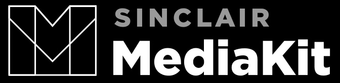
Results
After an internal design review and based on the feedback received, this was the final option.


What's I've learnt
Exploring brand voice, developing brand attributes and then referring to them while working on branding is super important. Investing time into this will inform the design direction and will ensure successful execution.