MediaKit is an internal-facing website used by Sinclair Broadcast Group various sales and sales support staff.
Over the course of 5 years it grew organically and transformed from a sales product intro website, to in depth educational resource, to a robust sales and marketing, education, sales strategies resource website. It is managed by various divisions of the company, which contributed to cluttering of content, duplications and inconsistencies.
With growing site and content complexity, it was important to re-design the site to organize the content better, get rid of redundancies and make it more user friendly, as well as the ability to grow without compromising site’s usability.
Overview
My role
- UX Design
- UI design
Length of project
10 months
Tools used
- Photoshop
- WordPress
- Sketch
Team
- 2 UX Designers
Project Requirements
Since the original website was created based on top down initiative, we needed to gain insights into who our users are and how they use this website. We were set out to do the following:
- Conduct research to learn how MediaKit is being currently viewed and used
- Create user personas based on our research findings
- Analyze and categorize current content on the site
- Build a new Site Map
- Build wireframes for the product pages
- Create visuals for the new version of the site
Research
With the input from the stakeholders, we have identified 3 core users that access various areas of MediaKit with various levels of frequency.
I began the process by analyzing what it is we are focused on learning, what and how to ask users, researching best practices and tools for surveys creation. At the end I’ve decided that Google forms would suffice for our need and have created the survey that was sent it out to about 500 users, with 98 recorded responses.
I found my findings informative — it has become obvious that the current version of the content organization was only partially working for the site visitors, as evident from the visuals below.

Ability to complete a task
Ability to complete a task

Ease of use
Ease of use

Frequency of use
Frequency of use

Descriptive words
Descriptive words
Audience
Upon completion of user interviews and surveys, we have gathered necessary information to create our user personas — the Digital Sales Manager, the Marketing Coordinator, and the Digital Sales Assistant.

Digital Sales Manager
Digital Sales Manager

Market Coordinator
Market Coordinator

Digital Sales Assistant
Digital Sales Assistant
Card Sorts
We’ve conducted an in-person card sort with several users in an effort to see how they would organize the content and got different results from each card sort, which gave me a direction but didn’t give me a clear answer.
Considering the amount of content and our resource limitations, we had to simplify basic categories and get rid of redundant content, i.e. sales decks, talking points, and the like. We wanted to see content-related logic of our users. To gain insight, we have conducted a digital card sort. We sent it out to over 500 users and have gotten 57 solid responses, all of them varied in quality of feedback.


Proposed Site Map
")


Based on the feedback provided from the card sort, and in an effort not to overlook anything while dealing with limited scope of content during the card sort, I have catalogued all of the pages currently housed on MediaKit site.
In my research I have discovered that there were quite a few orphan pages, some were published, but not surfaced. Others were set to private view only.
Then I evaluated and categorized the content by its type. At that point for the sake of faster workflow I organized the content using the whiteboard and moved into Sketch to create a new Site Map based on its logical categories.
Wireframes
Once the site map has been approved by the stakeholders, we decided to tackle the page structure. Our first priority pages were the solutions pages. All of them are different and all varied by content. The primary concern for the stakeholders was the product knowledge for the sales staff — our users. The primary concern for our users was the ability to get to the documents they need in the most efficient way as well as the ability to order said solution. I do have to mention that there is a disconnect between how our end users utilize this website and how the stakeholders think it should be or is being used.
The stakeholders seemed to have been taken by surprise when they’ve learnt about said differences in perception.
I was given the list of the desired content on the page. With the requirements of both groups in mind, I organized the information logically in a digestible way. I chose to explore paper wireframes first, as they are easy and fast to produce.

List of required content
List of required content

Content hierarchy on the page
Content hierarchy on the page

Grouping related content
Grouping related content

Final Wireframe
Final Wireframe
Final Solution Page Wireframe
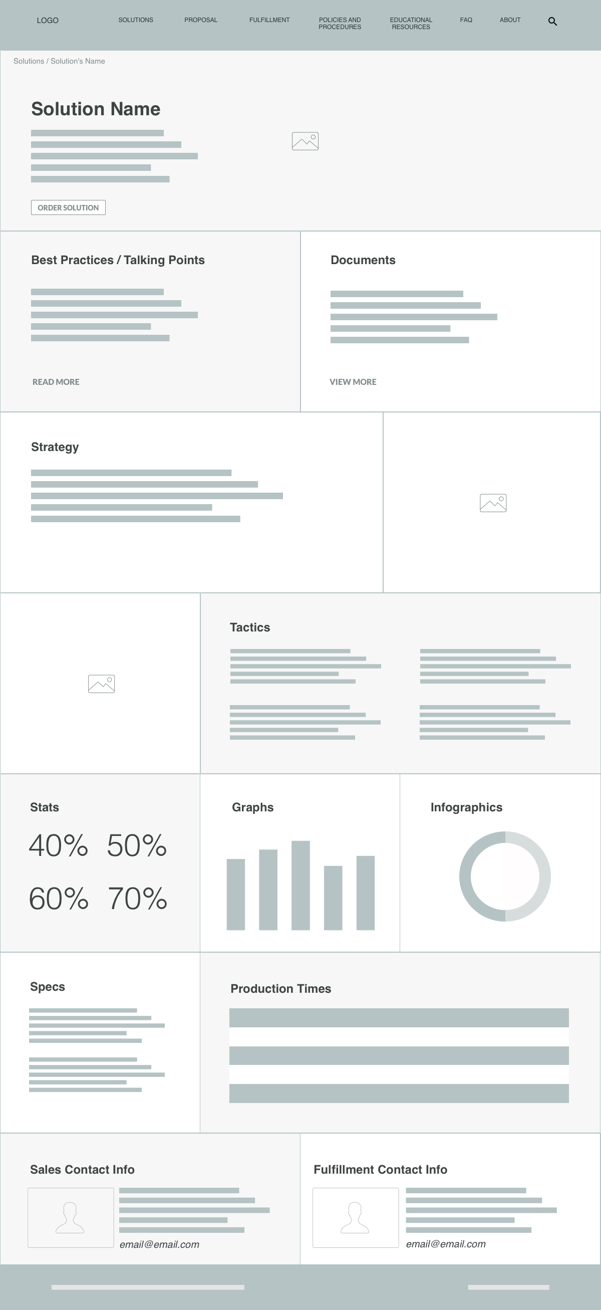
I have organized the content based on our users desires of the documents and best practices/talking points to be available at the top of the page along with a CTA to order the solution.
Then I added the strategy and tactics below, followed by stats / graphs / infographics, product specs and production times, and a contact on the bottom.
For user testing, I have added some general content and some imagery, so the user could connect with the task better, without it being fully polished.
Even though originally I planned on having a built-in contact form to enable user to reach out to a subject matter expert, after some research it became clear that most people prefer to copy and paste the email address into the address bar themselves, which gives them a feeling of being in control and they are sure the email have reached the recipient. As opposed to having a button that launches an email app, which often is unexpected to the user.
In addition, there was an additional contact added, since each solution has a separate sales and fulfillment contacts.

Prototype and User Testing
To test my hypothesis and assumptions for the nav layout, taxonomy, content grouping and hierarchy, I’ve created 2 simple prototypes in Invision and have distributed the link to a few users requesting their feedback, around the following tasks.
To test the nav
- From the Homepage on the Nav locate Solution 1 link and navigate to that page
- On the Nav locate Marketing Strategy by Platform and navigate to that page
- On the Nav locate Newsletter link
To test the Solution page
- Order a solution
- Discover additional Best Practices
- Discover Internal Documents
- Contact a Subject matter expert
In the feedback that I have gotten there were no concerns voiced on usability, naming conventions, and content organization. There were some abstract questions not related to the task, so I asked for clarification.
Results

Clear call to action to order the solution described on the page
All the documents and talking points are at the top of the page for easy and quick access
Separate section for marketing strategy and marketing tactics.
A clear point of contact for each solution for transparency.
Since the user testing validated my assumptions and no concerns were raised. I have mocked up the page based on the wireframe. This mock was used in creation of various solution pages. The content for each solution differs, but the content architecture noted in the wireframe was to be followed.
Along with content re-organization, the site needed to employ better conventions to imply interactivity. I opted for using cards with images along with small description for each of the products, which made them look “clickable” according to our guerrilla user testing. The card then would lift up and have a drop shadow on hover.


What I've learned
In this project I have observed the disconnect between stakeholders’ idea of how this sales resource website should be used in the field and how it was actually being used by the end users. I had to advocate for them by informing the stakeholders of the research findings and remind of users’ actual needs repeatedly.
I’ve learnt that user feedback is not always clear and often I had to interpret it, and then to validate my interpretation via user testing.