Overview
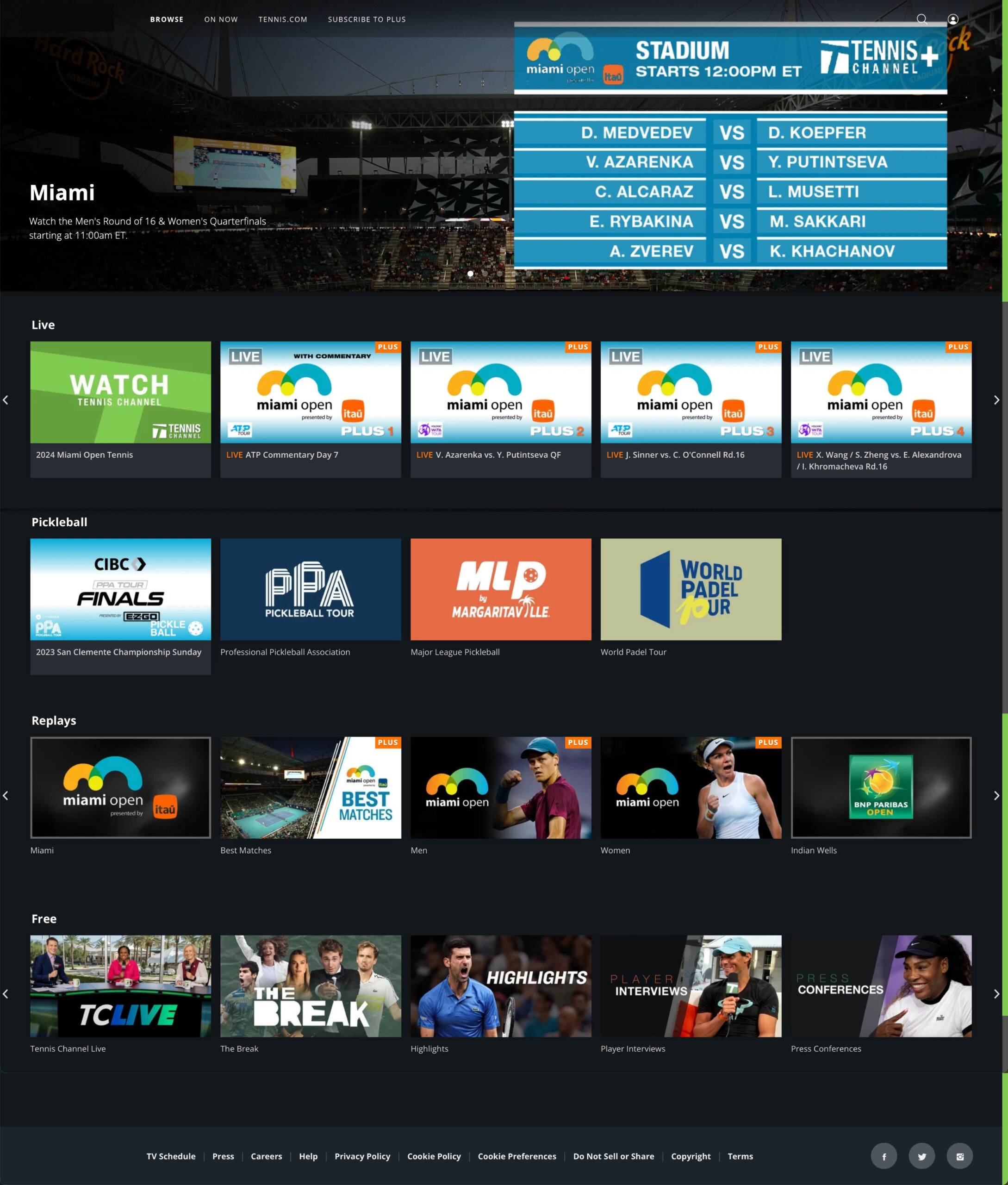
Tennis Streaming is a SaaS sports content streaming product that has not been updated for 5 years and has an outdated user experience. This frustrates our customers as they feel they are not getting enough value for the price. The experience does not meet user expectations.
My role
- Product Design
- Research
- Art Direction
Length of project
1 year
Tools used
- Figma
- Miro
- MS Suite
- Survey Monkey
Team
- 1 Product Design Director
- 3 UX Researchers (one also fulfilled a product designer role)
Current product

Overall Constraints
I got to wear many hats: together with my research partner I ran the discovery study with persona validation, usability testing, created multi-platform UI and interaction design.
Overall constraints:
- Relatively short timelines
- Limited user testing
- Incomplete design requirements
- No Product Owner
- The development is outsourced to various vendors, which complicates communication and collaboration process
- Multiple platform requirements for TV streaming apps
Process
The unknowns:
- Who our customers were
- Their goals
- Important to them features
- What is our brand equity
- What is our value
Workshop
In preparation for the onsite qualitative research workshop I helped facilitate, a survey was deployed by my colleague to gather quantitative data on Tennis Channel’s place in the space of sports streaming and to understand our product equity.
Subsequently, a handful of survey participants were recruited for this workshop.
Persona Archetype
This workshop was a great way to learn who Tennis Channel subscribers were, their goals, motivations, and what features were currently missing. In preparation for the workshop.
From our research, we learned that the majority of our subscribers are Tennis superfans. They watch the game of tennis several times a week and plan their day around watching it. Additionally, many play it competitively, know their rankings and attend tournaments in-person.
Based on survey findings, workshop insights, we’ve created a proto persona. Which was subsequently validated in the discovery research that followed.
Tennis Super Fan Customer Journey
Additionally, other shortfalls were uncovered, such as performance, usability, and access rights issues. While we couldn’t do a lot about the access rights, there were certainly things that we could address.
We mapped our findings into the following user journey, containing these three parts:
- Pre-watch — superfans anticipate, plan, and prepare for the event
- Watch — they watch the match of interest
- Post-watch — they may discuss it with their friends, watch post-match interviews and recaps, and check players’ standing.
Phase 2: MVP for Budgeting Pitch
TV and Web
I started this process by looking at other sports streaming apps to gain knowledge of the current trends and at the various streaming apps’ rebrands for inspiration. Subsequent competitive analysis followed, just not at this phase.
We then decided to align the website’s and TV app’s interaction and layout for feature parity. I worked on aligning the designs with MVP requirements.
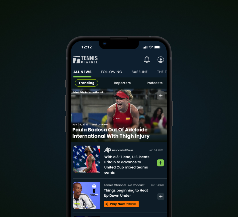
Everything Tennis app
As a part of the overall assessment of current properties, it’s been identified that in addition to Tennis Channel, there was Tennis Channel Plus, Tennis Channel International, Tennis.com, Tennis magazine, and a Tennis merchandise e-commerce site. All this contributed to brand dilution. Users didn’t find value in the printed magazine, which led to discontinuing the print production, resulting in substantial, tangible savings to the company.
From the research findings, and as depicted in the user journey, Tennis Channel was facing several significant tactical and strategic challenges, e.g., performance and UX, as well as positioning the brand as a Tennis Authority for our Tennis superfans.
For this substantial product overhaul, budget needed to be considered. We then set out to create the MVP designs for a mobile app that combines the offerings of Tennis.com and streaming capabilities in a single convenient app, while engaging users in pre-watch and post-watch phases of the Tennis experience journey.
While the final outcome differs from the proposed designs, this MVP informed the direction. In the end, we were able to secure the funding necessary for the product redesign.
What I learned
Working on this project was challenging in many ways — from losing a product owner in the middle of the project, vendor shopping and requirements negotiations, technical feasibility limitations, and more. I got an opportunity to work on discovery research, run a benchmarking study with my colleagues in addition to working on product design, which was invaluable for my growth as a product designer and a qualitative researcher.
If you are interested in seeing more, please reach out!


